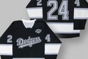
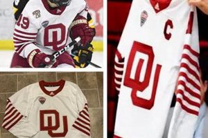
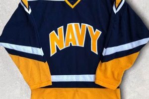
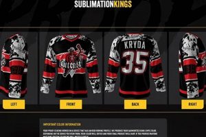
Visual identity for a team is paramount. This identity is often most prominently displayed on the garments worn by the players. A specific example would be the customized apparel used in ice hockey, typically featuring team colors, logos, and player numbers.
The aesthetics of team wear are significant for several reasons. They contribute to brand recognition, foster team unity, and create a sense of belonging among fans. Historically, the evolution of team attire reflects changes in fashion, technology, and cultural values, impacting both the performance and the perception of the sport.
Understanding the key elements that comprise effective visual team representation and the options available in their creation is essential for any team seeking a strong brand presence.
Considerations for Effective Hockey Jersey Design
The following considerations are vital for creating a team visual identity that resonates with players and fans.
Tip 1: Color Palette Selection: The chosen colors should align with the team’s identity and evoke the desired emotional response. A study of color psychology can be valuable in this regard. For instance, blue often represents stability and trust, while red symbolizes energy and excitement.
Tip 2: Logo Integration: The team logo must be prominently featured and proportionally sized. Ensure scalability so it remains legible across various formats, from small merchandise to large banners. Improper logo integration can dilute brand recognition.
Tip 3: Numbering and Lettering Clarity: Player numbers and names must be easily readable from a distance. Employ a clear, bold font and high contrast between the lettering and background. Inadequate legibility diminishes the professional appearance of the team.
Tip 4: Material Selection: Choose materials that are durable, breathable, and comfortable for players. Modern performance fabrics offer moisture-wicking properties that enhance player comfort and performance. Inferior materials can lead to discomfort and reduced performance.
Tip 5: Design Simplicity: Avoid overly complex patterns or excessive embellishments. A clean, streamlined look enhances visual impact and ensures the team’s visual identity remains timeless. Overly intricate designs can appear cluttered and unprofessional.
Tip 6: Brand Consistency: Ensure the visual identity is consistent across all team-related materials, including uniforms, merchandise, and marketing collateral. This reinforces brand recognition and strengthens the team’s overall image. Inconsistent branding creates confusion and dilutes the team’s identity.
Adhering to these tips contributes to a teams enhanced visual presence, contributing to improved team cohesion and fan engagement.
The next section will address the practical aspects of implementing a design, from initial concepts to final production.
1. Color Palette
The selection of a color palette is a foundational element in crafting impactful team visual identities. It sets the tone, evokes emotional responses, and contributes significantly to brand recognition. The team’s visual garment relies heavily on a well-chosen palette to effectively communicate its identity.
- Symbolic Representation
Colors possess inherent symbolic associations. For example, a team opting for blue and white may be aiming to project an image of trustworthiness and purity. Conversely, red and black might convey aggression and power. These choices should align with the team’s ethos and intended perception.
- Contrast and Visibility
Effective palettes prioritize contrast to ensure visibility on the ice. High contrast between colors used for the primary garments, numbers, and lettering is crucial for player identification and fan engagement. Poor contrast can hinder visibility and reduce the overall impact.
- Historical Context
The history of a team or its city can influence the palette. Teams may incorporate colors from local flags, historical events, or significant landmarks. Such choices connect the team to its community and create a sense of shared identity.
- Brand Consistency
The color palette must remain consistent across all team-related materials, including uniforms, merchandise, and marketing campaigns. A unified color scheme strengthens brand recognition and reinforces the team’s overall image. Inconsistent palettes create confusion and weaken the brand’s impact.
Ultimately, the selection and execution of a color palette are integral to the success of team visual identity. A well-considered palette enhances visual appeal, reinforces brand recognition, and connects the team to its community and fanbase.
2. Logo Placement
Logo placement on team garments is a critical element of visual identity. The positioning and size of the logo directly impact brand recognition and the overall aesthetic of the garment. In ice hockey, where speed and distance often obscure details, strategic placement ensures the logo remains visible and identifiable to spectators. A poorly positioned or improperly sized logo can diminish the impact of the visual design, rendering it ineffective in conveying the team’s brand. For example, a logo placed too low on the torso may be obscured by equipment or player movement, while one that is too small may be indistinguishable from a distance.
The primary team logo is typically featured prominently on the chest area, often centrally located. Shoulder patches, if present, provide additional opportunities for logo placement, showcasing secondary logos or sponsors. Adherence to established branding guidelines is paramount, ensuring consistency in logo usage across all team-related materials. Professional sports organizations often have strict protocols regarding logo placement to maintain a cohesive brand image. Consider the Edmonton Oilers’ classic logo placement on their primary sweater, which has become synonymous with the team’s identity over decades. This consistent application has solidified brand recognition and fan loyalty.
Proper logo placement is not merely an aesthetic concern but a strategic imperative. The effective display of the team logo reinforces brand identity, enhances fan engagement, and contributes to the overall professional image. Careful consideration of size, location, and consistency is essential for maximizing the impact of visual garments. Ignoring these considerations can lead to a diluted brand presence and a missed opportunity to connect with fans and stakeholders.
3. Font Legibility
Font legibility is a crucial, yet often overlooked, component of hockey jersey design. It extends beyond mere aesthetics, directly affecting player identification and fan engagement. The selection and application of appropriate fonts for player names and numbers influence the clarity and impact of the overall design.
- Distance Visibility
The primary function of lettering on a hockey jersey is to allow for quick and easy identification from a distance. Larger fonts with sufficient stroke weight ensure that numbers and names are legible even from the stands or during fast-paced gameplay. Consider the wide adoption of block lettering, known for its clear, simple forms, to maximize visibility on the ice.
- Contrast Considerations
Contrast between the font color and the fabric background is critical for legibility. A dark font on a light background, or vice versa, provides optimal contrast. Subtle color variations or low-contrast combinations can significantly reduce legibility, particularly in low-light conditions. Many teams utilize contrasting borders or outlines around the lettering to further enhance visibility against busy patterns.
- Font Style and Character
While stylistic fonts may enhance the aesthetic appeal, legibility should take precedence. Ornate or overly stylized fonts can be difficult to read, especially at a distance. Simple, clean fonts such as sans-serif types generally offer superior legibility compared to more decorative serif fonts. Choosing a font that complements the team’s branding without compromising clarity is paramount.
- Consistency Across Sizes
Font legibility must remain consistent across different jersey sizes. A font that appears legible on a small jersey may become cramped and difficult to read when scaled up to larger sizes. Designers must consider how the font scales and adjust spacing or stroke weight as needed to maintain optimal legibility across all sizes.
These facets underscore the importance of prioritizing function in design. The aesthetic appeal of a hockey jersey is secondary to its practical purpose of identifying players. By adhering to principles of distance visibility, contrast, stylistic clarity, and size consistency, designers can ensure that font legibility enhances both the functionality and visual impact of visual garment.
4. Material Durability
Material durability is a paramount consideration in team visual garment design, directly influencing the longevity, functionality, and overall value of the garment. The rigorous demands of the sport necessitate the selection of materials capable of withstanding considerable wear and tear.
- Abrasion Resistance
Ice hockey jerseys are subjected to frequent contact with equipment, ice surfaces, and opposing players. Materials must possess high abrasion resistance to prevent premature wear, pilling, and tearing. Reinforced stitching and strategically placed durable panels can further enhance resistance in high-stress areas. An example of this is the use of double-knit polyester, known for its tightly woven construction and ability to withstand repeated friction.
- Tear Strength
The risk of tearing is inherent in a contact sport like ice hockey. High tear strength is essential to prevent minor rips from propagating into larger, irreparable damages. Interlock knit fabrics, with their interlocking loops, provide superior tear resistance compared to simpler knit structures. A jersey constructed from a material with low tear strength is prone to significant damage during gameplay, potentially compromising the player’s safety and the team’s professional image.
- Colorfastness
Repeated washing and exposure to sunlight can cause colors to fade, detracting from the visual appeal. Materials with inherent colorfastness, or treated to enhance color retention, ensure that the jersey retains its vibrant appearance over time. Sublimation printing techniques, where dyes are infused directly into the fabric, offer superior colorfastness compared to traditional screen printing methods. A faded or discolored jersey reflects poorly on the team’s branding and professionalism.
- Moisture Management
While not directly related to physical durability, a material’s ability to manage moisture contributes to the overall lifespan of the garment. Materials that wick moisture away from the body help prevent the buildup of sweat, which can degrade fabrics and promote the growth of bacteria, leading to unpleasant odors and premature deterioration. Modern performance fabrics, like moisture-wicking polyester blends, are commonly used to address this concern.
The interplay between material durability and design is pivotal for creating professional and effective team visuals. These facets contribute to the garment’s functionality, lifespan, and overall aesthetic appeal, influencing both player performance and fan perception.
5. Design Simplicity
In the context of hockey jersey design, design simplicity refers to the principle of minimizing unnecessary elements to enhance visual clarity and brand recognition. This approach prioritizes functionality and immediate recognition over intricate details that may detract from the garment’s overall impact.
- Reduced Visual Clutter
Minimizing unnecessary design elements enhances visual clarity. Removing excessive stripes, complex patterns, and superfluous embellishments allows the team’s logo and colors to take precedence. For instance, the classic Detroit Red Wings jersey, with its straightforward red and white design, exemplifies how simplicity can create a timeless and recognizable visual identity. Overly complicated designs can dilute the team’s brand and make the jersey appear cluttered.
- Enhanced Brand Recognition
Simpler designs are often more memorable and easier to reproduce across various media. A clean, uncluttered logo and color scheme facilitate quick recognition by fans and casual observers alike. The Montreal Canadiens’ iconic blue, white, and red jersey, with its central “CH” logo, is a prime example of how simplicity can create a strong and lasting brand association. Complex designs may be difficult to recall and replicate accurately, hindering brand recognition.
- Improved Visibility on the Ice
During fast-paced gameplay, clear and uncluttered jerseys enhance player identification. Simpler designs allow numbers and names to be more easily distinguished from a distance. The New York Rangers’ traditional blue jersey, with its bold white lettering and minimal striping, prioritizes visibility on the ice. Overly intricate designs can make it difficult for spectators and officials to quickly identify players.
- Cost-Effective Production
Simpler designs often translate to more cost-effective production processes. Fewer design elements can reduce the complexity of manufacturing, minimizing material waste and labor costs. A jersey with a simple design and limited embellishments is generally less expensive to produce than one with intricate details and multiple layers. This can be particularly important for teams operating with limited budgets.
By embracing design simplicity, hockey teams can create visual identities that are both impactful and enduring. This approach prioritizes clarity, recognition, and functionality, resulting in jerseys that effectively represent the team’s brand while enhancing the viewing experience for fans.
6. Brand Consistency
Brand consistency, as applied to hockey jersey design, involves the uniform and strategic presentation of a team’s visual identity across all aspects of its operations, with the jersey serving as a primary symbol. This entails meticulous adherence to established brand guidelines regarding color palettes, logo placement, font usage, and overall design aesthetic. The failure to maintain consistency weakens brand recognition, potentially eroding fan loyalty and diluting the team’s market presence. Consider, for instance, the Boston Bruins: their black and gold color scheme and spoked “B” logo have been consistently featured on their jerseys for decades. This unwavering commitment has solidified the team’s brand identity and fostered a strong connection with its fanbase. Deviation from these established elements, even in subtle ways, can create dissonance and undermine the team’s brand image.
The impact of brand consistency extends beyond aesthetics. It directly affects merchandising sales, sponsorship opportunities, and the team’s overall valuation. A consistently branded jersey is more likely to resonate with consumers, driving sales and generating revenue. Sponsors also value brand consistency, as it ensures their logos are presented in a professional and recognizable manner. Teams that prioritize brand consistency often command higher sponsorship fees and attract more lucrative endorsement deals. In contrast, inconsistent branding can create confusion and diminish the team’s appeal to both consumers and corporate partners. The frequent logo and color scheme changes implemented by some NHL teams in the past resulted in decreased merchandise sales and negative fan feedback, highlighting the tangible consequences of neglecting brand consistency.
Maintaining brand consistency in hockey jersey design presents unique challenges, including the need to balance tradition with innovation and adapt to evolving fashion trends. However, the long-term benefits of a consistently branded jersey far outweigh the potential risks associated with deviating from established guidelines. A well-defined and consistently applied brand identity fosters fan loyalty, enhances the team’s market value, and strengthens its overall presence in the competitive world of professional sports. Ultimately, brand consistency in hockey jersey design is not merely a matter of aesthetics but a strategic imperative for sustained success.
7. Team Identity
Team identity, representing a comprehensive brand and culture, is intrinsically linked to visual garments. These garments serve as a visible representation of the team’s values, history, and aspirations, embodying the essence of the collective. The connection significantly impacts team cohesion, fan engagement, and overall brand perception.
- Symbolic Representation
The visual garment acts as a symbolic representation of the team’s ethos. Colors, logos, and design elements convey specific messages and evoke desired emotional responses. For example, a team might choose a color palette to evoke feelings of tradition, strength, or innovation. A logo can symbolize the team’s history or connection to a particular city or region. The placement and design of these elements contribute to the creation of a cohesive and recognizable team identity.
- Fan Engagement
The visual garment is a key driver of fan engagement. Fans often purchase and wear team apparel to demonstrate their support and affiliation. A well-designed jersey can become a symbol of team pride, uniting fans and creating a sense of community. The success of a team’s jersey design often translates directly to merchandise sales and increased fan involvement. Consider the impact of a newly designed visual garment generating excitement and anticipation among fans, solidifying their commitment to the team.
- Historical Context
The history and evolution of a team’s visual garment contribute to its overall identity. Past designs, significant victories, and iconic players are often reflected in current visual garments, creating a sense of continuity and tradition. A visual garment may incorporate elements from past eras, paying homage to the team’s legacy and connecting with long-time fans. This connection to the past reinforces the team’s identity and strengthens its emotional bond with its supporters.
- Competitive Differentiation
The visual garment serves as a means of differentiating a team from its competitors. A unique and memorable design can help a team stand out in a crowded marketplace. Innovative color combinations, distinctive logos, and unconventional design elements can create a visual identity that captures attention and distinguishes the team from its rivals. A successful visual garment design can become a competitive advantage, attracting new fans and sponsors.
These facets illustrate the profound connection between team identity and the visual garment. A well-designed visual garment transcends mere aesthetics, serving as a powerful symbol of the team’s values, history, and aspirations. It fosters fan engagement, reinforces brand recognition, and contributes to the team’s overall success. These considerations highlight the importance of strategic design in creating a garment that resonates with both players and supporters.
Frequently Asked Questions
The following questions address common inquiries regarding the creation and implementation of effective hockey jersey designs.
Question 1: What factors contribute to an effective color palette selection for team garments?
Effective color palette selection considers the symbolic representation of colors, contrast for visibility, historical context relevant to the team, and brand consistency. Each aspect ensures the team’s ethos is conveyed effectively.
Question 2: How does logo placement impact brand recognition for team attire?
Logo placement is critical for brand recognition. Strategic positioning, appropriate sizing, and adherence to branding guidelines maximize visibility and ensure the logo remains identifiable to spectators and consumers alike.
Question 3: What principles govern font legibility in the context of player names and numbers?
Font legibility prioritizes distance visibility, contrast between the font and background, stylistic clarity, and consistent scalability across all jersey sizes. These principles ensure player identification is clear and immediate.
Question 4: Why is material durability a crucial consideration in uniform construction?
Material durability influences the garment’s longevity and functionality. Abrasion resistance, tear strength, colorfastness, and moisture management are critical attributes that withstand the demands of the sport and maintain a professional appearance.
Question 5: How does design simplicity contribute to a more impactful visual garment?
Design simplicity enhances visual clarity, brand recognition, and on-ice visibility by minimizing unnecessary elements and visual clutter. This approach ensures the logo and colors take precedence, creating a memorable and easily recognizable identity.
Question 6: What are the potential consequences of inconsistent branding across team-related materials?
Inconsistent branding can weaken brand recognition, erode fan loyalty, and diminish the team’s market presence. Uniformity across all team materials strengthens the brand and fosters a cohesive image.
Adhering to these answers enables a more effective and efficient team jersey design.
The subsequent section will delve into the future of team apparel design, examining emerging trends and technologies.
Conclusion
The preceding analysis underscores the multifaceted nature of hockey jersey design. A confluence of elements, from strategic color palettes to durable materials, determines the effectiveness of a garment in representing a team’s identity. Ignoring these critical considerations risks diminishing a team’s brand presence and ultimately, its connection with fans.
As the sport continues to evolve, so too must the approach to team visual representation. Teams seeking sustained success must prioritize both tradition and innovation, leveraging design as a tool to strengthen brand recognition and foster a lasting legacy.


